Let Your Light Shine

Category: Uncategorized (Page 4 of 11)

Being Creative with a Traditional Theme

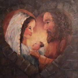
When I saw the announcement from the Martin De Porres Center for a show titled, “Sacred Images of Jesus and Mary” I wasn’t sure I wanted to enter.  The theme brought to mind the religious art of centuries past that you see in museums or on Christmas cards.  The show was an opportunity to show art that might not be accepted in secular spaces and for the De Porres Center to obtain art for their annual Christmas card. There were no prizes.  Although the venue is beautiful, the events held there are not likely to result in sales.


So…

I waited to see when and if inspiration might strike and I can’t say that I did a lot to encourage it until about a week before the September 14th deadline.  Then  I went through a stash of old Christmas cards and a few books looking for a concept.  I happened upon a doodle in my sketchbook for a very stylized Christmas card that I made for my family a few years ago.  I decided on a square canvas and began to refine it.

It’s pretty traditional.  I thought the heart-shaped window made of stone was a little creative and I wanted to make sure the people looked at least somewhat Middle Eastern.

When I went to the show’s opening I was really impressed by the creativity, especially by the artists from the group, Creative Women of Color.  The photos below include some of their work.

“The Guardian II” by Kenya Davis

“Chosen” by Janet George


This was a large painting done on plywood with charcoal.


Here is my painting hanging with some of the more traditional ones. 


This is the painting by artist Patricia Howard that was chosen for the Christmas card.

It wasn’t until I wrote this blog that I realized that I’ve entered three shows with a spiritual theme in the last few years and all three entries included faces of women.  Something to think about??

State Fair 2018

Butter cow?  Ferris wheel?  Pigs?  Cotton candy?  No shortage of things to paint at the state fair.  This year’s plein air competition started on Wed. July 25, the first day of the fair with check-in at the Cox Fine Arts building on the south side of the fairgrounds.  Unfortunately the parking passes they gave to competitors were for the north lot, so the day began with a trek to get canvases stamped.


I knew I wanted a midway picture because nothing says Ohio State Fair like lemon shake-ups, tents and rides.  I found a sweet spot away from the crowds with reliable shade for several hours.  This painting spent a long time at the ugly stage so there weren’t too many folks stopping to chat.

The best part of that day was when the All-Ohio State Fair Marching Band stopped right in front of me for a concert.  They were awesome!  You have to be young to do march and make music in the hot sun.  I worked a few of them into my painting very quickly.  It was hot and humid so I ate lunch and trekked back across the grounds before 1:30.


On the way out the first day, I checked out the Budweiser Clydesdales.  When one of them gave me the most soulful look,  I decided I’d spend the next day painting there. (Their tent was also a shorter walk from the parking lot!) 

The next morning I asked one of the attendants about their schedule. I had to make sure they wouldn’t be leaving in the middle of my painting.  They weren’t due to parade till 4:00.  The attendants graciously  let me work in their restricted area while one of them washed each horse’s feet.   I had plenty of time to paint various horses in the same pose. The one in the painting is a composite. I had plenty of onlookers this time.  Everybody loves the Clydesdales!

Spa Day

After the shampooing was complete I stayed to do a portrait. Ivan wasn’t into posing. It was interesting to watch all the work that the crew does to keep those horses looking good and feeling healthy.

On the last day I decided to pay for parking by the south gate so I could drop off frames at the Cox Fine Art Center.

I headed out to find some cooperative cows to paint.  At the OSU Veterinary Medicine area they had dairy cows and three of them were due to calf soon.  I did a jillion quick sketches up close but couldn’t get anything I liked.  Then I stepped back and decided to include the vet student on maternity watch in the painting.  This was a quick one.

Maternity Ward

So I framed and entered Spa Day and Maternity Ward and went home to put my feet up.  There were some truly outstanding entries in the competition, but none of those award winners are on this page.  No matter.  I tried something new and had lots of fun.

Before and After


Before

After

I’ve been playing around with a method for improving paintings. My mind is analytical which has some benefits and drawbacks as an artist.  Since there is little I can do to change it, I might as well go with it.

After I complete a first draft of a painting I put it on my mantle for a few days.  When I’m ready to finish it, I invest time in systematic reflection.  I want to have a punch list of changes before I touch paint or brushes.  If I don’t, I’ll just waste time mucking around without significant improvement.

I use a notebook. First, I note glaring problems like the shepherd’s crook that needs cleaned up and the birds that aren’t noticeable.  I take into account Rich Clem’s advice from our Central Ohio Plein Air group critique -“Get rid of the tree on the right.  It doesn’t help the composition.”  I want to see if he’s right, so I cover it up.  Yes, I think he is!  I still want to keep the stump for the bird but I can lose a lot of that tree in shadows and/or foliage.

Then I look for a strong center of interest.  When I planned the composition I placed the larger feeder 1/3 of the way down from the top and 1/3 of the way over from the right to be in the sweet spot.  It seems to work, but could be strengthened with some subtle tweaks to the background.

The next thing I want to consider is the color scheme.  I was painting from nature but I can control how I represent it.  This painting uses all of the greens and all of the reds on the color wheel for a complementary color scheme.  That’s why the yellow-orange on the smaller feeder looks out of place.  I can switch it to red-orange.

Then I work my way through the principles of design:  unity, contrast, dominance, repetition (with variation), alternation, balance, harmony and gradation.

Dominance jumps out as a problem.  The original painting is about half green.  I don’t really have a dominant value either.  Even though I did a gray-scale sketch before-hand, I work backwards and do a thumbnail to see where I stand.  If I skinny up the tree on the left, I increase the green and the middle values.  That also has the advantage of overlapping the small feeder with green foliage instead of framing it within the rectangle of the tree.  

Alternation might also be a problem.  I could do a better job of connecting the darks.Then I run through the elements of design (line, value, color texture, shape, size, movement) to see if I get any new insights. Just where do the lines lead?  I can play with that in the foliage and blossoms.  Then I’m ready to work my way through the list to the new and improved painting below.


Reworked Painting

Please leave a comment about my self-critique.  What did I miss?  Do you have a similar process?  I’m keeping the notebook so that I can go back and look for patterns.  If you have a process for self-critique I’d love to see it.


« Older posts Newer posts »